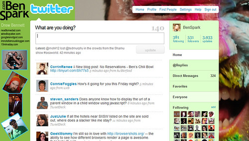
As twitter grows more and more popular it is important that you brand yourself and quick. I myself have been using twitter for quite a while and yet only today did I make myself a twitter background.
One thing to take into consideration when making a twitter background is that the background is static while twitter itself is fluid. What that means is that you may create a wonderful background for your giant monitor but to the average person on their 15″ or 17″ monitor might not be able to see your hard work. On an 800 X 600 screen you aren’t going to see anything in the background. I worked off a 1024 X 768 screen. This is about the smallest possible size to use where you start to see the background and you should use it as your starting point. This means that you have a small size to effectively work with. And to make matters more challenging you only have 1004 X 512 or so to work with, so you better make it count.
I have noticed that many big name bloggers (tedmurphy, Chrisbrogan, and Jim Kukral) have some great background but at larger sizes. While these backgrounds are really slick they do lose something in translation when an average user has a smaller screen. One thing I learned as a web designer is design for the lowest common denominator. That means make your background something everyone can see. (Jim Kukral’s comes closest to this size).
Do you have a Twitter Background? Do you need a template? Should I make one available?
By the way, what about the people who have the bigger screens? You also need to have something for them too. So I made one that is 2048 X 800, which when scales down to 1004 X 512 shows exactly what I want it to show.
If you aren’t already following me on Twitter go check out my background in action and please follow me too.


