Last night I installed the WordPress Plug-in WPtouch after I watched a very informative video by Chris Pirillo.
I’ve been using my iTouch quite often, I got it from coComment. I noticed that when I load blogs on it I have to expand each one so I can read the content of the posts. This takes time and when I don’t have a lot of it I skip ahead to a faster loading blog. I stumbled upon the video above while looking for ways in which to add a blog icon to my blog so it can show up on the iTouch/iPhone home screen. I wanted to make my blog stand out on the iPhone.
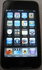
Notice the two blog icons at the bottom of my iTouch home screen. One is for The BenSpark and the other for The Wired Kayaker.
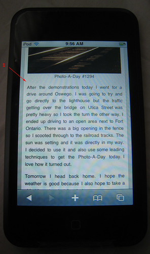
I downloaded and installed WPtouch and added a blog icon for this blog to the proper location. Then I went to my iTouch to see what the blog looked like. Here are some screen shots that show the features of using WPtouch. Basically, what the plug-in does is that it reformats your blog into an iTouch compatible theme. This speeds up load times and improves readability of your posts. This is what it looks like.
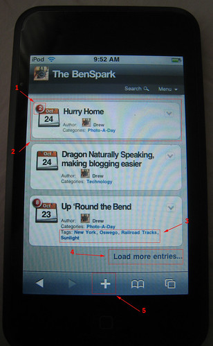
- The number of comments on a post and the date of the post
- A snapshot of your post, with a large link to push to go directly to the content of that post
- Categories and Tags are included for additional navigation
- You can quickly load additional entries
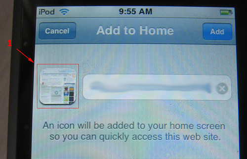
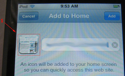
- Click the “+” sign to add this blog as a bookmark or better yet add it to your home screen
Here are two well known blogs on the iTouch, how easy to read are they?
 Shoemoney.com |
 JohnChow.com |
Not very, you have to pinch and expand each one just to read a post.
What I am going for is ease of readability and speed of load time. I want readers to instantly recognize my blog and add it to their Home Screen, so I had to give them something that was recognizable for my brand.

When you add BenSpark.com to the iPhone/iTouch home screen you get a distinctive and recognizable image that you can click to go directly to the BenSpark Blog.
So now that a reader has added The BenSpark to their iTouch they can click it right from the Home Screen and go right to my blog. Once they are there they can click on any of the latest blog posts or choose to see some older ones. Once they select a blog post they will see a well formatted and easy to read blog post. See what I mean below.

- Search box, readers can type in search terms to find posts from you
- Post titles can include the date, time,
- author and gravatar as well as an option to
- skip to the comments section.

- You can still show your affiliate items in the posts.
- SezWho plug-in is supported with WPtouch
- Sociable plug-in is supported by WPtouch plug in
- You can show your categories
- You can show your tags
- Navigating between posts is easy.

- With WPtouch you can easily choose whether or not to show gravatars on your posts
- The plug-in Comment Luv is also compatible with the plug-in WPtouch
But what if you want to see the blog as it was created and intended to be seen on a browser. That is easy, you can select that option at the bottom of each screen.
I hope that you can now see the importance of making your blog stand out on the iTouch/iPhone. With so many people using both products it would be a waste not to enhance your blog to serve their needs as well, especially when you can use a great plug in like WPtouch. There are many more features to the plug-in itself, you can set colors, decide if gravatars will be seen and even add additional icons for each of your blog pages like the about page and disclosure policy page.
* One caveat is that if you are using WP-Cache you need to configure it. And if you are using WP Super Cache. Currently, it does not work correctly with WPtouch. They’re working on it, though. Visit the WPtouch homepage for updates.
