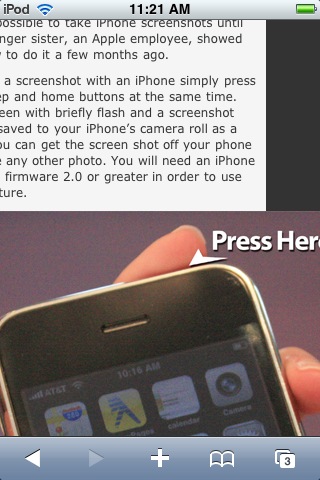
A post by Ted Murphy about how to take a screenshot of your iPhone made me think about branding and the iPhone. Ted always makes me think about branding because he does it so very well. However, as I discovered, he and many other high quality brand market gurus have not branded well for the iPhone & iPod Touch. Sorry Ted, but here is my chance to educate you a little and I’m not gonna bark at you like a deranged little league parent at 5:30am. Okay, watching that video again wasn’t so bad, it was actually a bit motivating. Maybe I was biased last time I watched that video because I had just finished a Golden Girls Marathon. But seriously, I like Ted, he is great at what he does and he can take a little constructive criticism. He’s been taking so much un-constructive criticism for years, so this little post from me should be a cake walk.
Branding for the iPhone & iPod Touch
I am shocked at how many big name bloggers haven’t taken the time to install a couple simple and free plugins to make their blogs more reader friendly for the iPhone & iPod Touch and to support branding. A quick look at
shows me that their blogs are not optimized for the iPhone or iPod Touch. Ted Murphy’s blog actually is somewhat formatted for the iPhone & iPod Touch, but not as well as BenSpark.com is. In order to optimize your blog for the iPhone & iPod Touch you should be using one simple but very powerful plugin.
Wptouch Plugin by Brave New Code
The WPtouch plugin makes formatting changes to your blog automatic so that iPhone/iTouch readers get a valuable user experience. I wrote about the WPtouch plugin once before but this time I’m focusing a bit more on branding. This plugin will automatically format your blog to be easily readable on the iPhone or iPod Touch. This means that images will be formatted to screen size automatically, the user experience is clean and simple. Users also have the option to view your blog as they would on a full browser. However, I have found that viewing a blog like you would in a full size browser is very hard to enjoy, what with all the pinching and squeezing and moving the screen around. No, WPtouch makes everything very nice.
Sure it looks nicer but what about branding?
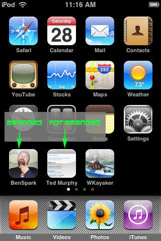
Another thing that WPtouch allows for is branding by the use of icons for the iPhone or iPod Touch home screen, and you even see your branded icon at the top right of the screen when you view your blog. Take a look at this screen shot to see what I mean. This is the home screen of my iPod Touch. Notice the icon for BenSpark and the icon for Ted Murphy?
WPtouch allows you to add a home screen icon to your blog. That icon will automatically show up when users want to add your blog to their home screen for quick and easy access back to your blog.
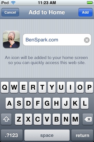
Adding BenSpark.com to your Home Screen
Here is where you can add Benspark.com to a Home screen on an iPhone or iPod Touch. Notice that there is a branded icon.
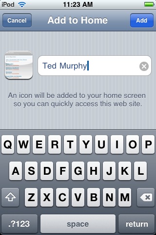
Adding Ted.me to your Home Screen
Here is where you can add Ted.me to a Home screen on an iPhone or iPod Touch. Notice that there is no branded icon.
The instructions for adding the iPhone/iTouch icon to your blog with WPtouch might be a little beyond the average user, you have to FTP it to a folder in that plugin folder. An easier way to add not only an iPhone/iTouch icon but also a favicon and an RSS icon is to use the plugin Blog icons. Make sure your icon is the correct size and also a .png format, that seems to be the only format that works with the uploading option on this plugin. However if you’ve already uploaded the icons somewhere else you can easily link to them.
How else does WPtouch make your blog stand out
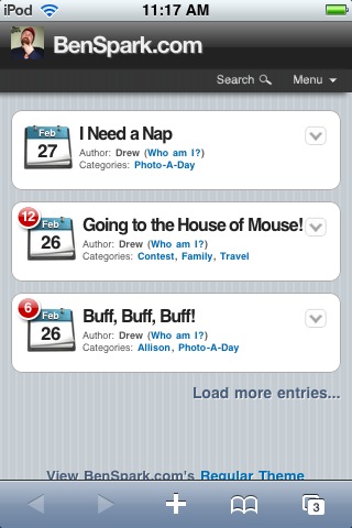
When a reader visits a blog using WPtouch they see the blog title and blog icon at the top of the screen. There is also a search function and a drop down menu where users can subscribe to the RSS feed, e-mail the blog owner or return to the Home page of the blog. This bar appears on each page as the reader browses your blog.
This is the page that viewers see initially when they look at BenSpark.com on the iTouch. Notice the branded logo on the top of the screen. There is a search option and a drop down menu, Individual posts are big and bold with categories, a listing of the number of comments, the date is also clearly shown as well as the author.
For most blogs when you visit them on the iTouch you see the full size blog squished down, so then you have to wait for all the icons, advertising and everything else to load. WPtouch enabled blogs load much quicker. Ted may or may not be using WPtouch. If he is then he is using a stripped down version, if he is not then he is using something that makes his blog load quicker on the iPhone. He’s a self proclaimed Apple Fanboy so you know he’s going to know how to make the blog itself look good on the iPhone.
Ted’s blog makes for easy reading because the posts are given to your right up front. However, there is no branding images. Also each post doesn’t really pop, there are more posts listed which is a good thing. However, no search feature and no menu of other actions are available on that initial page.
Let’s look deeper
If you click on a post on Ted’s blog it looks pretty well formatted until you get to the images.
The images are not automatically formatted to the size of the viewing area. Also looking further at posts on Ted’s blog you don’t automatically see the comments for the post and it looks like other plugins are not supported with whatever Ted is using to make his blog more viewable on the iTouch. I do have to say Ted is considerably ahead of most in his thinking about the user experience on the iPhone. However, if he and everyone else reading this implements WPTouch on their blog their posts are going to look well formatted like those on BenSpark.com.
Notice the Branded icon on the top of the screen, a nice bold header and an option to skip to comments. Also take notice that the image is formatted to fit perfectly in the viewing area. If you scroll through and read the post you will get to the bottom where I have a number of plugins also doing their thing. And you see all the comments of users with gravatars and many other great features.
Final Words
If no one can determine which blog is yours just by looking at an icon on their home screen on their iPhone/iPod Touch then they won’t chose your blog to go to to read. If your blog is hard to read on the iPhone/iPod Touch then people won’t go to it and read it. Take a little time and learn about the WPtouch, a valuable plugin and implement it on your blog. Also add the Blog icons plugin to your blog so that you can easily add a favicon or use it as another way to add the iTouch Home screen icon for your blog. When thinking about branding think about all users and their experiences with your blog, if it is easy and quick to load, read and navigate your blog then more people will be apt to read you on all platforms.
How about you?
Are you using WPtouch? Do you see a downside to using it? Have you had good experience using it? Tell me about it!


